Introduction to BarCharts
BarCharts, also known as bar graphs, are a staple in the world of data visualization. They are used to represent data in a way that is easy to understand and compare. Each bar represents a category of data, and the length of the bar corresponds to the value or frequency of that category. This visual representation makes it simple to see differences and trends at a glance.
The Basics of BarCharts
At their core, BarCharts consist of two axes: the x-axis (horizontal) and the y-axis (vertical). The categories being compared are listed along one axis, typically the x-axis, while the values or frequencies are listed along the other axis. Bars can be displayed horizontally or vertically, depending on the preference and the nature of the data.
One of the main advantages of BarCharts is their simplicity. They are easy to read and interpret, making them a popular choice for presentations and reports. Whether you’re comparing sales figures, survey results, or any other type of categorical data, BarCharts provide a clear and effective way to present your findings.
Types of BarCharts
BarCharts come in various forms, each suited to different types of data and analysis needs. The most common types include:
Vertical BarCharts:
Also known as column charts, these are the most common type of BarChart. Categories are listed along the x-axis, and the values are represented by the height of the bars.
Horizontal BarCharts:
In this type, categories are listed along the y-axis, and the values are represented by the length of the bars. This format is useful when category names are long or when you need to compare a large number of categories.
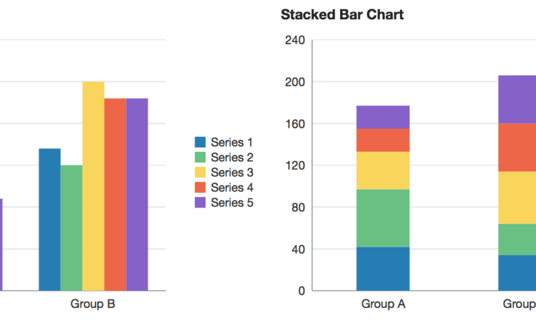
Stacked BarCharts:
These charts allow you to compare the parts of a whole. Each bar is divided into segments representing different subcategories, with the total length of the bar showing the overall value.
Grouped BarCharts:
Also known as clustered BarCharts, these are used to compare multiple categories across different groups. Each group is represented by a cluster of bars, with each bar in the cluster representing a category.
Advantages of Using BarCharts
BarCharts offer several advantages that make them a preferred choice for data visualization:
Clarity:
The visual format of BarCharts makes it easy to understand and compare data. Differences and trends are immediately apparent, even to those without a background in data analysis.
Versatility:
BarCharts can be used to represent a wide range of data types, from financial figures to survey results. They are suitable for both small and large datasets.
Customization:
BarCharts can be customized in numerous ways to suit the needs of the user. Colors, labels, and scales can be adjusted to highlight specific aspects of the data and improve readability.
Ease of Creation:
With various software tools available, creating BarCharts is straightforward. Programs like Microsoft Excel, Google Sheets, and specialized data visualization software offer simple interfaces for generating BarCharts.
Historical Background of BarCharts
The history of BarCharts dates back to the early 19th century. They have evolved significantly since their inception, adapting to new technologies and expanding in functionality.
The Origin of BarCharts
The concept of the BarChart can be traced back to the work of Scottish engineer and political economist William Playfair. In 1786, Playfair published “The Commercial and Political Atlas,” which included several types of charts, including the BarChart. Playfair’s charts were revolutionary for their time, providing a new way to present data visually.
Evolution Over Time
Over the years, BarCharts have evolved to become more sophisticated and versatile. Early BarCharts were hand-drawn, often requiring significant time and effort to produce. With the advent of computers and data visualization software, creating BarCharts became much easier and more efficient.
In the digital age, BarCharts have become a standard feature in various software applications. They are widely used in business, academia, and other fields to present data clearly and effectively. The ability to quickly generate and customize BarCharts has made them an indispensable tool for data analysts and professionals.
Modern Applications of BarCharts
Today, BarCharts are used in a wide range of applications. In business, they are used to present sales figures, financial data, and performance metrics. In academia, they are used to display research findings, survey results, and statistical data. BarCharts are also commonly used in media and journalism to illustrate data in news stories and reports.
The versatility of BarCharts has led to their widespread adoption across different fields and industries. They continue to be a valuable tool for anyone needing to present and analyze data in a clear and understandable format.
Creating Effective BarCharts
Creating an effective BarChart involves more than just plotting data points. To ensure that your BarChart is both informative and visually appealing, several factors must be considered.
Choosing the Right Type of BarChart
The first step in creating an effective BarChart is selecting the right type of chart for your data. As mentioned earlier, there are several types of BarCharts, each suited to different types of data and analysis needs.
Vertical BarCharts:
Use these when comparing a few categories with relatively short labels. They are ideal for showing trends over time or differences between groups.
Horizontal BarCharts:
Choose these when you have many categories or when category names are long. They are also useful for comparing values across different categories.
Stacked BarCharts:
Use these to show the parts of a whole. They are ideal for displaying the composition of categories and how they contribute to the total value.
Grouped BarCharts:
These are useful when comparing multiple categories across different groups. They allow you to see how each group compares to others in various categories.
Designing Your BarChart
Once you’ve chosen the right type of BarChart, the next step is to design it effectively. Here are some tips for creating a visually appealing and informative BarChart:
Use Appropriate Colors:
Colors can help differentiate between categories and make your chart more visually appealing. However, avoid using too many colors, as this can make the chart look cluttered. Stick to a consistent color scheme that is easy on the eyes.
Label Clearly:
Ensure that all axes and bars are clearly labeled. Use a font size that is easy to read, and avoid overcrowding labels. If necessary, use a legend to explain what different colors or patterns represent.
Scale Appropriately:
Choose a scale that accurately represents your data without distorting it. Avoid using overly large or small scales, as this can mislead viewers.
Highlight Key Data Points:
Use colors, patterns, or annotations to highlight important data points. This can help draw attention to specific trends or differences that you want to emphasize.
Common Pitfalls to Avoid
While BarCharts are relatively straightforward to create, there are some common pitfalls to avoid:
Overloading with Data:
Including too many categories or bars can make your chart look cluttered and difficult to read. Focus on the most important data points and consider breaking up large datasets into multiple charts.
Inconsistent Scales:
Using different scales for different parts of your chart can be misleading. Ensure that all bars are scaled consistently to accurately represent the data.
Ignoring Context:
Provide context for your data by including relevant information such as time periods, units of measurement, and data sources. This helps viewers understand the significance of the data being presented.
Neglecting Accessibility:
Make sure your BarChart is accessible to all viewers, including those with color blindness or other visual impairments. Use high-contrast colors and provide text descriptions where necessary.
Advanced Techniques for BarCharts
While basic BarCharts are effective for many purposes, there are several advanced techniques that can enhance their functionality and visual appeal.
Interactive BarCharts
With the rise of digital technology, interactive BarCharts have become increasingly popular. These charts allow users to interact with the data by hovering over bars to see additional information, clicking on bars to filter data, or zooming in and out to explore different levels of detail.
Interactive BarCharts are particularly useful for online presentations and dashboards, where users may need to explore data in more depth. Tools like Tableau, Power BI, and D3.js offer advanced features for creating interactive BarCharts that engage and inform viewers.
3D BarCharts
Three-dimensional (3D) BarCharts add depth to traditional BarCharts, making them more visually striking. However, they should be used with caution, as the added dimension can sometimes make it harder to accurately compare data. When using 3D BarCharts, ensure that the perspective does not distort the data and that all bars are clearly visible.
Animated BarCharts
Animated BarCharts add a dynamic element to data visualization. By animating changes in data over time, these charts can effectively illustrate trends and shifts. For example, an animated BarChart can show how sales figures have changed over several years, providing a clear visual representation of growth or decline.
Tools like Flourish and Highcharts offer features for creating animated BarCharts, allowing you to bring your data to life in a way that static charts cannot.
Combining BarCharts with Other Chart Types
In some cases, combining BarCharts with other types of charts can provide a more comprehensive view of the data. For example, you might combine a BarChart with a line chart to show both the overall values and the trend over time. This hybrid approach can help convey multiple aspects of the data in a single visual representation.
Practical Applications of BarCharts
BarCharts are used across various fields and industries to present data in an accessible and understandable format. Here are some practical applications of BarCharts: